Pantone recently released the new Color of the Year for 2015. This next year’s winner is Marsala.

I must admit I’m a little disappointed. The last few years I have been very pleased with the selections—Emerald, Radiant Orchid, Tangerine Tango—all of these really hit the mark for me and I knew I would have no problem incorporating them into new design projects. I had such high hopes for 2015’s Color of the Year and waited with much anticipation to view the results.
Marsala. A wine-inspired color that is most prominently described by Pantone as a “grounding red-brown.” Sounds great as a concept, right? Wine: warm, bold, dramatic, very different from the last three selections. I can envision this color on a fuzzy sweater, suede boots, accent pillows, drapes, as a bold lipstick or nail color… Yes, Marsala it shall be.
But wait—I feel like we forgot something here. Ah yes, the web. Oh right, and print design. As a flat color for web and print, I am less than impressed. For a color to truly be Color of the Year, I (apparently incorrectly) assumed that it should span the entire gamut of industries meant to use the color. Fashion, beauty: Pass. Web design, print design: Fail.
Compare in the photo above the glass of wine to the paper in the lower right. The wine looks warm, inviting and delicious. The paper looks flat and so… brown. Red-brown to be more specific. Such a “blerg” shade for web and print design, unless the client is in the culinary industry or an alcoholic poet.
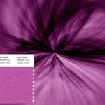
While most Marsala-inspired items can be quite lovely, the exact Pantone shade leaves something to be desired for those of us not in the fashion or beauty industries. Better luck next year for web and print designers. Oh, and in case you think my assessment is way off, here is a strip of the Pantone HEX approved color for the web. I rest my case.